We set out to create a more personalized experience to help users and their families find right application for them.
Recommender Tool
Role: Lead Researcher
Industry: Government
Deliverables: Research Plan, Prototype, Synthesis and Recommendations
The Problem
The legacy dynamic form on a government benefits platform was outdated, misaligned with current legislation, and often led users to dead ends or irrelevant applications. Its limited logic and long process made it difficult for users to confidently identify and apply for the benefit that best fit their needs.
Our team set out to redesign this experience to deliver quick, accurate, and trustworthy recommendations—ensuring users are guided to the most relevant application while also presenting helpful, context-aware alternatives when appropriate.
Methodology
Research goals, plan & methods
Recruitment

Our testing goals were to:
Find out how easily users understood and contextualized both the recommended and alternative benefit applications
Understand whether users trusted the recommendation
Assess the usefulness and visibility of alternative benefit pathways, especially when the primary recommendation wasn’t the right fit
Key research questions included:
Do users understand the path presented in the recommendation?
Do they feel the recommendation fits their personal situation?
Do they have enough information to confidently move forward?
Are they expecting different actions or benefits? If so, are those supported?
Execution
Synthesis
Method
Through testing, we identified several important takeaways from both proposed solutions:
The current form was outdated, misaligned with current legislation, and left users unsure of what to do next or in the worst case, a denial of benefits. Our solution introduced a smart logic–powered recommender tool designed to match users to the most relevant benefit application based on their profile information.
While this automated experience had the potential to reduce friction and improve trust, it was entirely new to the platform. We needed to validate whether users understood, trusted, and could navigate the recommendations, while identifying any pain points or breakdowns in the experience before implementation.
Since our approach leveraged automation and thus required a little action from the user action, our team prioritized thinking through language and developing clear information hierarchy. Our goal was to have users quickly locate the recommend benefit and easily understand why it was being recommended to them - building confidence and trust.
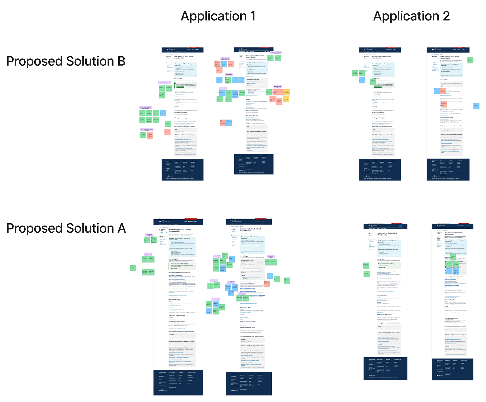
Prior to testing, our team met with appropriate stakeholders and the government platform team to review and provide approval on designs. Reviews were necessary for ensuring designs would meet government guidelines and remained consistent with the benefits platform in terms of language, information hierarchy, and overall look and feel. Discussions lead to two overall solutions, both leveraging the smart-logic approach.
To evaluate our solutions, we conducted remote moderated usability testing over Zoom. Participants interacted with two Invision prototypes, differing in organization of content and language
Proposed Solution A: Our team concept
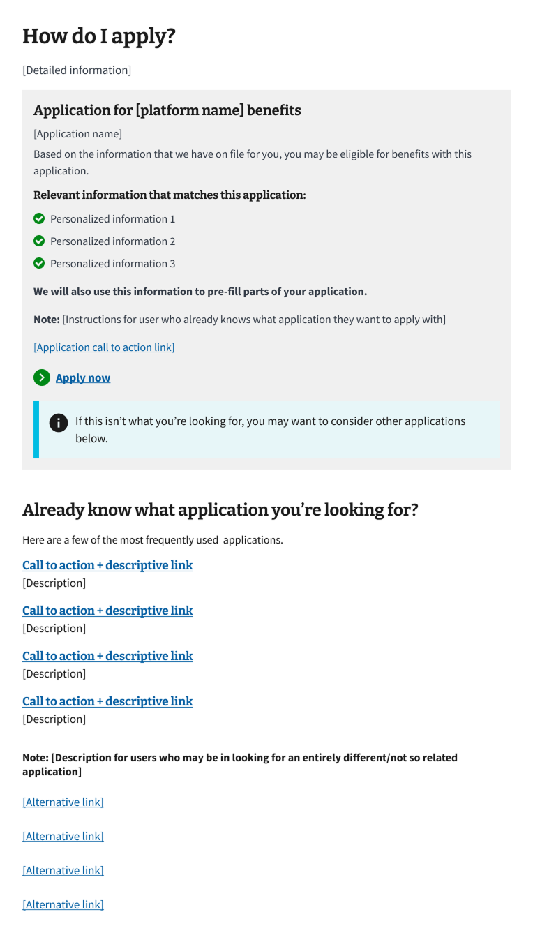
I developed the conversation guide (image below) aligned to our testing goals and key research questions.

Example excerpt from testing Conversation Guide
After our research materials had been discussed, drafted, and reviewed we began the recruitment process. The Veteran and dependents population is extremely diverse in regards to age, gender, education, disability ratings, digital literacy, and geographical location. To accurately assess our solution, we needed our participant pool to reflect such. In thinking through how to do so, we created participant criteria that our partner recruitment service could use during their process. Some example criteria we included were:
Participants that have not applied for nor have used GI Bill Benefits in the past
At least 1 woman of color
At least 1 participant 55 or older
At least one person that does not have a college degree (to include enlisted Veterans)
At least one person with a disability rating of 80% or greater
It was also important that we had users across the 3 major categories that corresponded to each of the online form recommendations our solution accounted for. Those categories include:
Veterans or active-duty Service members (Category A)
Depends of Veterans or Service members (Category B)
Dependents of a deceased, missing, or 100% service-disabled Veteran or Service member (Category C)
Our goal was to fulfill 9 total sessions, with equal representation from the 3 categories and that covered the diversity of the Veteran and dependent population outlined above. Once we reached data saturation, we concluded testing. In total, we were able to test with 9 of 15 scheduled participants.
Each session began with a way-finding task where users explained how they would locate the benefits recommender on their own. This allowed us to understand their mental framework and note where they are initially gravitating to find information. From there, we guided users through core tasks:
Locating and understanding their recommended benefit
Exploring alternative options if the primary didn’t apply
Interpreting CTAs, supporting content, and visual elements on the page
We listened closely for moments of hesitation, confusion, or misinterpretation. Users were asked to verbalize their thoughts while completing each task, allowing us to thoroughly capture their feedback.
After completing 8 sessions (our data saturation point), we synthesized insights collaboratively using affinity mapping.
Each feedback point—whether a pain point, quote, or observation—was mapped to specific parts of the prototype. We then grouped insights by sentiment and surfaced high-level patterns. This helped us identify key themes tied to trust, usability, and decision-making.
Once feedback was mapped, we used a level of effort vs. impact matrix to prioritize feedback that would deliver the most value for users before launch.
Successes:
Plain, direct language built trust and helped users feel confident in the recommendation
A clear information hierarchy made it easier to scan for key details and next steps
Thoughtful use of icons, color, and well-labeled CTAs helped users quickly understand what to do and where to go
Users trusted alternative recommendations when they were clearly marked and easy to understand
Painpoints:
In Solution B, off-ramps to other benefits were often overlooked due to placement and language
Some icons were ambiguous or distracting in Proposed Solution B, leading to minor navigation issues
Users wanted more upfront context to validate why they received the recommendation they did
Outcomes

Through our research, Solution A performed better overall in both comprehension and task completion. Participants found the language more approachable and the layout easier to navigate. Participants uniformly expressed that they didn’t feel the need to look elsewhere for clarification—signaling that trust and clarity were achieved.
Next steps
Proposed Solution B: Co-created with the government platform team
Key findings
This research validated our core approach while giving us clear direction for improving the alternative pathways and visual clarity. Our research process and findings were compiled into a powerpoint and shared with the government platform team, product owners, and internal leadership.
While research provided valuable findings, the work was put on pause due to a change business priorities.
Reflection
What I’d Do Differently
Test structure: While it was important to evaluate both proposed solutions, having participants walk through the same flow twice may have introduced bias due to familiarity. In the future, I would consider testing each version with separate user groups to reduce learning effects and capture cleaner feedback.
Session timing: Conducting sessions during the holiday season led to a higher-than-usual no-show rate. Although we ultimately reached data saturation by rescheduling and expanding our roster, the additional coordination extended our timeline and affected team capacity. Planning around key calendar events is something I’ll proactively account for in future research cycles.
How This Shaped My Perspective
This was my first time conducting usability testing with users that were not internal stakeholders. Hearing firsthand how they navigate benefits helped me better understand their priorities and the real-world impact of the products we build.
I also facilitated sessions with participants who had varying disabilities. I learned how important it is to build rapport early—users who felt comfortable were more likely to express clear, specific feedback. It deepened my appreciation for accessible facilitation practices and the value of inclusive research.